Ayusha Mehrotra
Senior UX Designer & Consultant


Document Analysis Tool
for Tax & Accounting Professionals
UX DESIGN | WORKSHOPPING | PROTOTYPING
As a lead designer on this product, I was tasked to shape the product from the ground up - from understanding user needs to defining core workflows. The result was Document Analysis, a tool that helps CPAs work more efficiently with complex client documents by automating data extraction, research, vouching, calculations, and summarization.
Whether assessing documents for tax or accounting treatment or automating complex audit testing, users can collaborate with an AI assistant, deploy AI agents for analysis, and review results in a spreadsheet-like interface with embedded citations.
Client: Thomson Reuters
Industry: Tax & Accounting
Role: Lead UX Designer


The Problem

First time users struggle to translate real‑world questions into reliably repeatable AI checks.
-
High‑friction set‑up: A rigid wizard forces users to declare every piece of context (input documents and tasks) up‑front, leading to confusion, abandoned sessions, and long time‑to‑value.
-
Inflexible post‑run: Once a Grid is executed, even a minor metadata tweak requires rebuilding the entire workspace, blocking iteration.
-
Creating questions takes a long time and its confusing: Users are not sure how they should craft the instructions for the AI.
-
Use-cases are not clear: There's no clear articulation of what a workspace (or grid) is supposed to be used for.
Ideation Workshop
Conducted a Product Ideation Workshop with engineers and PMs to brainstorm scope and align on product direction.
The session was structured as a design studio based on scenarios, where cross-functional teams worked through defined use cases to create solutions. Activities included problem framing, scenario mapping, rapid concept sketching, solution presentations, and group critique to refine ideas and surface technical considerations early.
The workshop then focused on prioritizing and defining inputs and outputs to clarify system behavior and scope. We outlined key assumptions, dependencies, and constraints, aligned on MVP boundaries, and established a prioritized set of next steps. The outcome was clear scope definition, shared ownership across engineering and product, and a concrete foundation for execution.
Design Studio


Defining Use Cases
Refining Inputs & Outputs with use cases


Inputs & Outputs
Product Flow Mapping


2x2 Prioritization

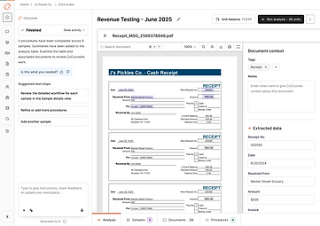
What does Doc Analysis do?
This grid-based agent experience allows CPAs to run the same questions, analyses, and checks across multiple documents at once.
By organizing AI-driven work in a familiar spreadsheet-style table, it automates repetitive workflows like audit testing, document review, and research enabling users to work in batch, compare results side by side, and focus on validation rather than manual execution.
Key Features
-
Spreadsheet‑lite Grid Interface
-
Setup via a chat based AI Assistant
-
Easy Iteration & Combined Setup/Post‑setup User Flow
-
Robust Review & Remediation of AI Output
-
Highlighted Source Document Export
Early Wireframing


Drove early wireframing to shape and validate core product concepts before committing to high-fidelity design. Developed low-fidelity screens and flow diagrams to define user paths, system states, and primary interactions, ensuring clarity around inputs, outputs, and edge cases.
Functional Flow Mapping

Final Wireframes


1
Workplace Customization
2
2
Samples, Documents &
Procedures Setup


3
Sorting & Tagging of Uploaded Documents

4
Auto assigning of Documents to Samples

Sample Viewing Extracted Data
from Documents
5

Analysis Results
6

8
Viewing Extracted Data from Documents mentioned in Citations
Procedure Results
7
Iterative User Testing
The goal of this research was to evaluate the Document Analysis Flow understanding how participants interpret the interface, navigate through the workflow, and interact with AI-generated outputs. We examined whether participants understood how to start using the tool, upload and analyze workpapers, review AI activities, and move between various tabs (e.g., Samples, Documents, Procedures).
This study also explored user reactions to the grid design, their trust in the AI-driven process, their expectations for automation, and their preferences for reviewing and refining procedures.
RESEARCH FINDINGS
Participants need clearer onboarding and first-step guidance to understand the tool’s purpose and confidently begin working .
Although participants notice the tabs at the bottom of the workspace, the lack of clear labeling prevents them from confidently using them for key actions.
The procedures tab lacks clarity and needs standardized templates to reduce the burden of manual setup for every client.
Participants understand how to upload workpapers but expect clearer entry points and faster, more flexible upload options.
Transparency into AI activity is essential for building trust and helping participants verify that the AI is accurate.
The chat feature fails to capture attention, making participants miss a powerful automation capability.
Reviewing AI-generated analysis requires better visual cues, evidence linking, and annotation tools to build user confidence.
RECOMMENDATIONS
Participants struggled with knowing what the tool was for and how to get started. Some described the interface as “empty,” while others suggested needing templates, examples, or a walkthrough to help them take their first steps.
Combine onboarding elements like a “Start Here” prompt,sample data, or contextual tooltips to give users more direction at first entry.
Most participants saw the tabs (Analysis, Samples, Documents, Procedures) but did not immediately understand their full functionality. Participants explored the tabs out of curiosity & were confused by their labeling, expecting more familiar audit terminology.
Add descriptive hover labels or short onboarding text for each tab to clarify their purpose and expected actions.
Participants engaged with the Procedure tab but often found its wording and steps unintuitive.They wanted the templates and pre-configured procedures tied to client types to reduce the manual setup burden.
Refine procedure terminology and introduce templates or defaults that match common audit workflows.
Participants could upload workpapers but noted that the upload button located in the bottom of the chat text box section was not prominent enough. Participants also wanted multiple upload options such as drag-and-drop or hover-preview features.
Make the upload button more prominent and add secondary
upload methods like drag-and-drop or batch upload.
Participants wanted clear visibility into what the AI extracts and how it generates outputs. Participants specifically asked for the AI to highlight or circle the information it used and emphasize the need for verification before trusting results.
Show a “review panel” where the AI highlights extracted data and links it back to source documents for verification.
Although some participants recognized the chat as similar to other AI tools, their attention was drawn more to the grid. The chat lacked visual emphasis and clear affordances, which caused some participants to overlook it as a key workflow feature.
Visually differentiate the chat panel (e.g., bold header, shading, or collapsible panel) and highlight its key capabilities in an initial prompt.
While participants appreciated the AI-generated analysis, they stressed the need for clearer visual cues to verify results. Participants requested features to highlight failed tests, review evidence, and annotate results. Without these, users may lack confidence in the AI’s accuracy.
Provide color-coded indicators for results, clickable evidence
previews, and annotations directly within the analysis screen.
Learnings
-
Early prototyping with AI tools shifts feedback left
Rapid prototyping using tools like Figma Make and v0 helped validate ideas earlier, surface edge cases sooner, and align stakeholders before designs became costly to change.
-
End-to-end ownership within sprints improves decision clarity
Being involved from problem framing through validation allowed for more intentional trade-offs and tighter alignment between user needs, technical feasibility, and business goals.
-
Complex AI-driven experiences demand strong content collaboration
Partnering closely with content was critical in making advanced AI workflows understandable, trustworthy, and usable, highlighting that UX clarity is as much language as layout.
-
Continuous feedback loops strengthen systems thinking
Regular design reviews and user testing helped evolve the product from isolated solutions into a cohesive, scalable design system over time.